
Custom Press Limited: Website Redesign + Ontario Search Growth
How DotConnex helped turn a dense legacy website into a clearer commercial printing experience with stronger service hierarchy, better customer pathways and a site structure designed to support search growth across Waterloo Region and Ontario.
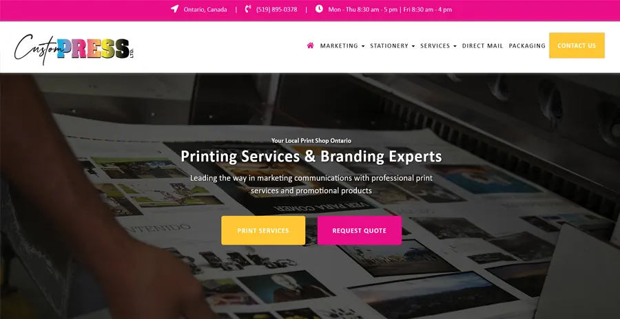
Making a Large Commercial Printing Offer Easier to Navigate
Custom Press Limited is a commercial printing company serving businesses that may need everything from everyday business printing to marketing materials, labels, packaging and custom print solutions.
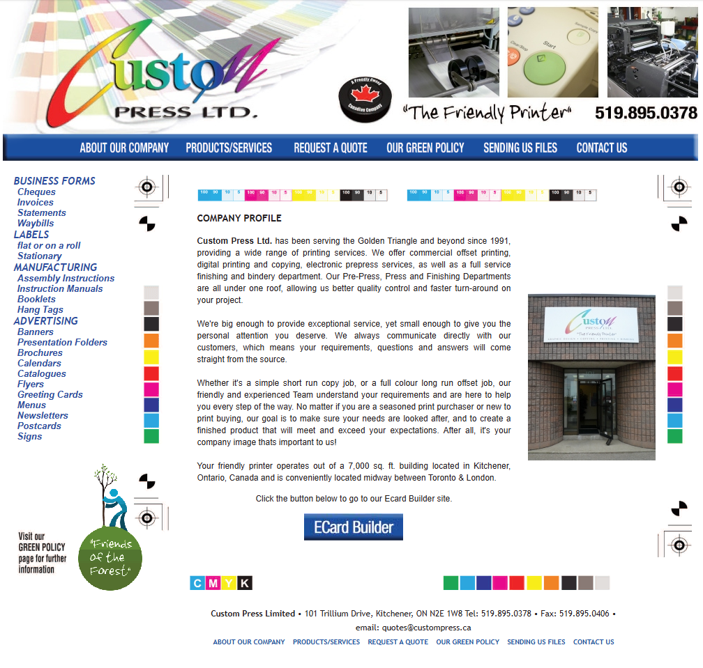
The original website contained a significant amount of useful information, but that information lived inside a dense legacy layout. The redesign opportunity was not simply to make the site look newer. It was to create stronger hierarchy, make the services easier to understand and give visitors clearer ways to move toward the type of printing they actually needed.
The new structure also had to support more than a local presentation. DotConnex planned the website and SEO foundation around commercial printing visibility across Waterloo Region and broader Ontario markets, connecting website design and search engine optimization from the start.
From a Dense Legacy Layout to a Clearer Commercial Experience
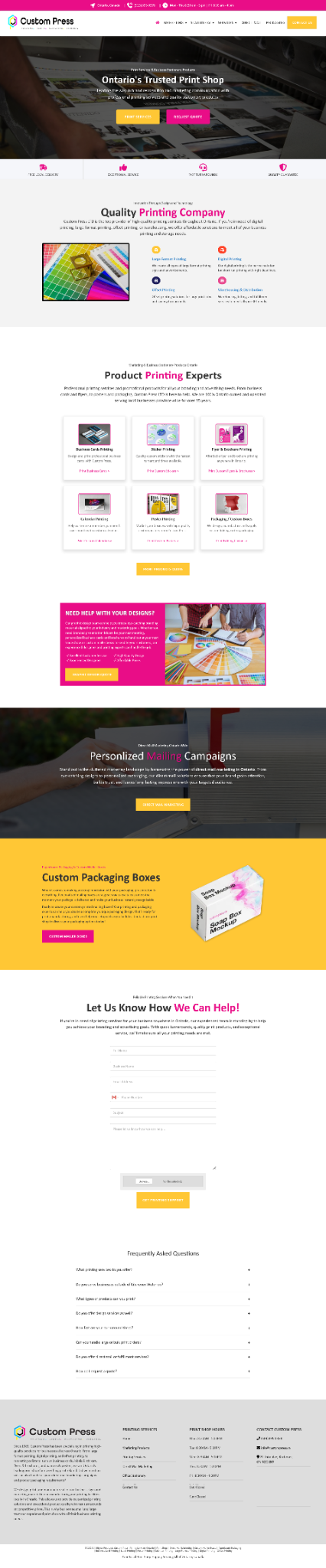
Both frames use authentic Custom Press website screenshots. Scroll inside either frame to compare the original presentation with the current website.
The Site Had Useful Information, but Needed Stronger Structure
Commercial printing covers many products and customer needs. When too much information is presented with equal weight, visitors have to work harder to understand where to go next.
Organize the Services
The site needed clearer separation between the major types of printing and supporting services so visitors could move into the right part of the offer faster.
Modernize the Experience
The legacy layout needed a more current visual system, stronger hierarchy and a responsive presentation that worked better across modern devices.
Support Search Intent
Commercial printing searches can be product-specific, service-specific or geographic. The website needed room for those distinct search intents rather than treating every topic the same way.
Scale Beyond One Market
The foundation needed to support Waterloo Region while also creating room for legitimate Ontario-wide search growth as the strategy expanded.
Make the Site Easier for Customers and Easier for Search Engines to Understand
The redesign focused on organizing the commercial printing offer into clearer pathways while preserving useful information and creating a structure that ongoing SEO work could build on.
Turn Service Depth Into Clearer Navigation
The existing site had useful service information, but the redesign needed to make that depth easier to scan and understand. Stronger hierarchy helps visitors move from a broad printing need toward the most relevant service.
Preserve What Was Already Valuable
A redesign should not automatically discard useful pages, topics or search relevance. Existing content and URLs were treated as inputs to the new structure rather than something to ignore.
Create Search-Focused Topic Separation
Commercial printing, marketing materials, labels, packaging and custom print needs can represent different customer searches. Separating important topics creates clearer relevance and stronger internal linking opportunities.
Build for Ontario Growth
The site was structured so the business could support Waterloo Region visibility while expanding into broader Ontario markets without relying on thin, repetitive pages.
Design, Architecture and SEO Working as One Commercial System
The strongest improvement came from connecting the redesign with the way customers search for, evaluate and buy commercial printing services.
Website Structure
- Clearer hierarchy across major printing services
- More deliberate navigation into product and service categories
- Responsive presentation for current devices
- Stronger calls to action and customer pathways
SEO Foundation
- Service pages organized around distinct search topics
- Internal linking between related commercial print needs
- Technical and on-page structure designed for ongoing optimization
- Structured data support where appropriate
Market Expansion
- Waterloo Region relevance retained
- Website copy and structure able to support Ontario-wide searches
- Room for legitimate city and market expansion where useful
- Broader commercial positioning without losing local credibility
Commercial Printing Creates Strong AI-Search Content Opportunities
A commercial printer has practical knowledge that generic articles cannot reproduce well without first-hand experience. Customers have real questions about paper stocks, finishing, quantities, file preparation, labels, packaging, turnaround, production methods and the trade-offs between different print options.
That makes the website more valuable when it explains those decisions directly. Instead of publishing broad content that simply defines printing terms, the stronger long-term strategy is to document real production considerations, common customer questions and the reasoning behind different print recommendations.
That kind of first-party information supports traditional SEO while also creating stronger source material for AI-powered search systems looking for specific, useful answers.
What This Project Reinforced for Established Service Businesses
A website can contain a lot of valuable information and still be difficult to use if the structure does not help visitors understand what matters first.
Changing a mature website without considering existing URLs, content and internal relationships can create unnecessary search problems.
A broad commercial printing offer creates many legitimate search topics when those services are organized around distinct customer needs.
Ontario growth is stronger when market pages reflect real service reach and useful local context rather than repeating the same page for every city.
A Clearer Website With More Room for Organic Growth
The current Custom Press website presents the company with stronger hierarchy and clearer pathways into its commercial printing services than the legacy site.
More importantly, the new foundation gives ongoing SEO work a better structure to build on across service topics, Waterloo Region visibility and broader Ontario search opportunities without relying on generic or repetitive content.