
Skal Legal: Website Redesign + Service Clarity
How DotConnex replaced a limited four-page website with a clearer, more professional legal and notary experience built around service discovery, trust and stronger site architecture.
Turning a Limited Website Into a Stronger Professional Foundation
Skal Legal already had a live website before DotConnex became involved. The previous site was very small, with only a handful of pages, and several structural issues made the experience harder to navigate and harder to build on for search.
During the original review, the About link led back to the homepage through an index.html path, the Apostille area had limited and inconsistent navigation, and the logo did not consistently provide a clear route back home. The site also lacked enough page depth to properly separate the firm’s most important services.
The redesign focused on giving Skal Legal a clearer professional identity, stronger service architecture, more useful navigation and a foundation that could support Notary, Apostille, Document Drafting and other verified legal and notary services more effectively.
Project type: Website redesign of an existing Skal Legal website.
The Previous and Current Skal Legal Website
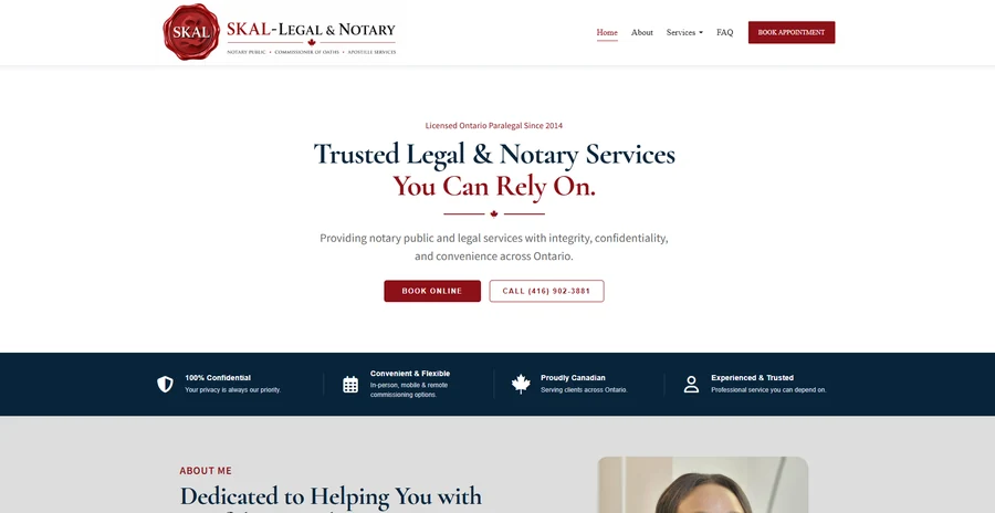
The screenshots below compare the original Skal Legal website with the redesigned version. Both are shown as full-page captures so the change in navigation, service depth, visual presentation and overall structure can be reviewed directly.
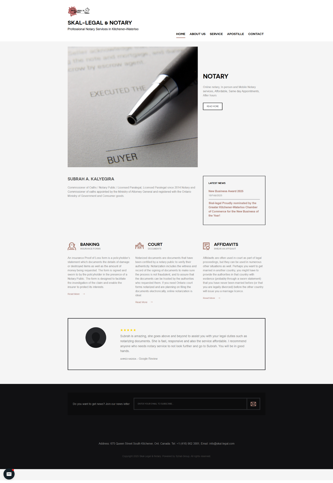
Scroll inside the frame to view the full previous website.
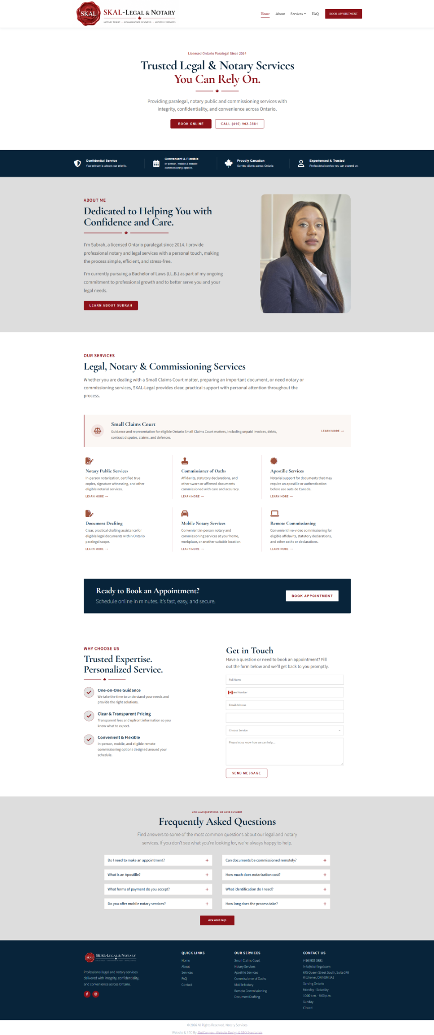
Scroll inside the frame to view the full redesigned website.
The Existing Site Needed More Than a Visual Refresh
The redesign had to correct structural problems while giving Skal Legal a stronger professional presentation and more room for service-focused content.
Fix the Navigation
The previous site included confusing page relationships, including an About link that returned visitors to the homepage through an index.html path.
Expand Service Depth
A very small page structure made it difficult to give priority services such as Notary, Apostille and Document Drafting enough dedicated information.
Improve Professional Trust
The visual system and content hierarchy needed to better reflect the credibility expected from a legal and notary services business.
Create an SEO Foundation
The new structure needed cleaner internal navigation, stronger service pages and a better foundation for future local and service-specific search visibility.
Rebuild the Architecture Around Services and Trust
The redesign treated the old website as a structural problem as well as a design problem. The goal was to create a site that was easier for clients to use and easier to expand over time.
Replace the Fragile Page Structure
The redesign moved away from the previous limited navigation and inconsistent page linking toward a clearer WordPress page hierarchy that could support more services.
Give Priority Services Their Own Space
Notary remained the primary service, while Apostille and Document Drafting also needed stronger visibility because of their importance to the business.
Strengthen the Professional Presentation
The redesigned site uses a more deliberate visual hierarchy, trust signals, service cards, appointment calls to action, FAQs and a clearer contact experience.
Build for Future Search Growth
A stronger site structure creates room for service-specific SEO, local relevance and useful first-party legal and notary information without forcing every topic onto the homepage.
Website, Content and Growth Working as One System
Professional Presentation
- Trust-focused design
- Clear service hierarchy
- Responsive layout
- Consistent professional tone
Service Access
- Straightforward navigation
- Online action paths
- Contact visibility
- Focused page structure
Search Foundation
- Descriptive headings
- Service-specific pages where supported
- Clear internal linking
- Accurate metadata
Where the Project Can Support AI-Powered Search
Legal AI-search content has to be handled carefully because users may interpret it as advice. The safest opportunity is first-party information about the firm’s actual services, process, jurisdiction, appointments and document requirements where verified.
That material can answer practical questions without pretending to replace legal advice.
The current project archive does not contain enough verified subject-matter detail to go further, so the case study deliberately avoids unsupported legal claims.
What This Work Reinforced
Clarity and credibility are more important than decorative complexity.
People visiting a legal site often have a specific task in mind.
Clear next steps help visitors move forward without searching the site for contact options.
Legal content should expand only where verified first-party information is available.
A Stronger Redesigned Foundation for Skal Legal
The redesigned Skal Legal website now gives the firm a clearer professional presentation, stronger navigation and more room to explain important legal, notary and commissioning services.
More importantly, the new structure replaces the limitations of the earlier site with a foundation that can support service-specific content, local search visibility and future first-party information without forcing every topic onto a small number of pages.